Federation Brunswick Home
This property in Brunswick was a typical Federation home, featuring the original front room and entrance. The rest of the house had a modern renovation from 15 to 20 years ago, and everywhere you looked, the property was white, white, white! To escape the monotony of all that white, my clients hired me to inject colour and fun!
The hallway
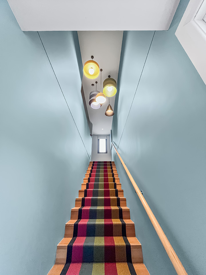
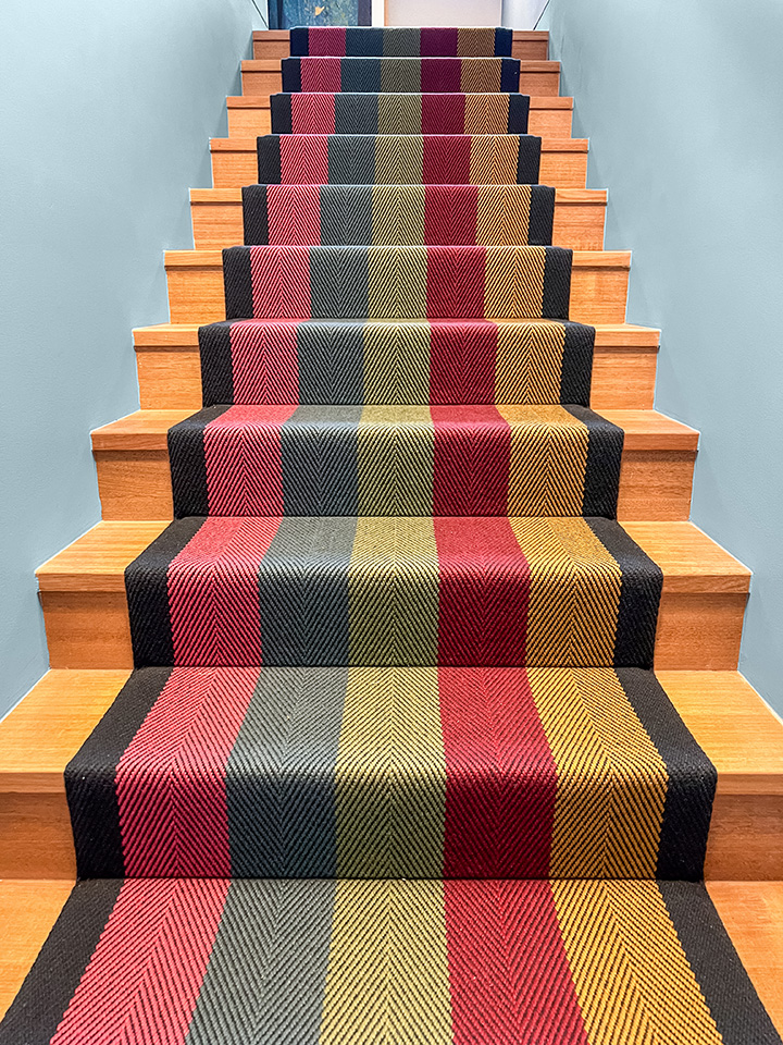
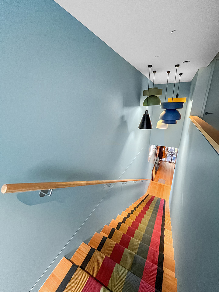
Starting at the front door, we painted the entrance hall a mid-tone blue, slightly darker than sky blue. We wanted to create a sense of both wow and homeliness the moment you entered. Upon entry, you look directly up the long flight of timber stairs. To break up this expanse, I specified a colourful bespoke stair runner. You can only smile when looking at it.
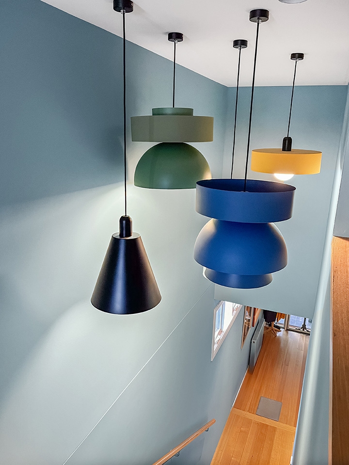
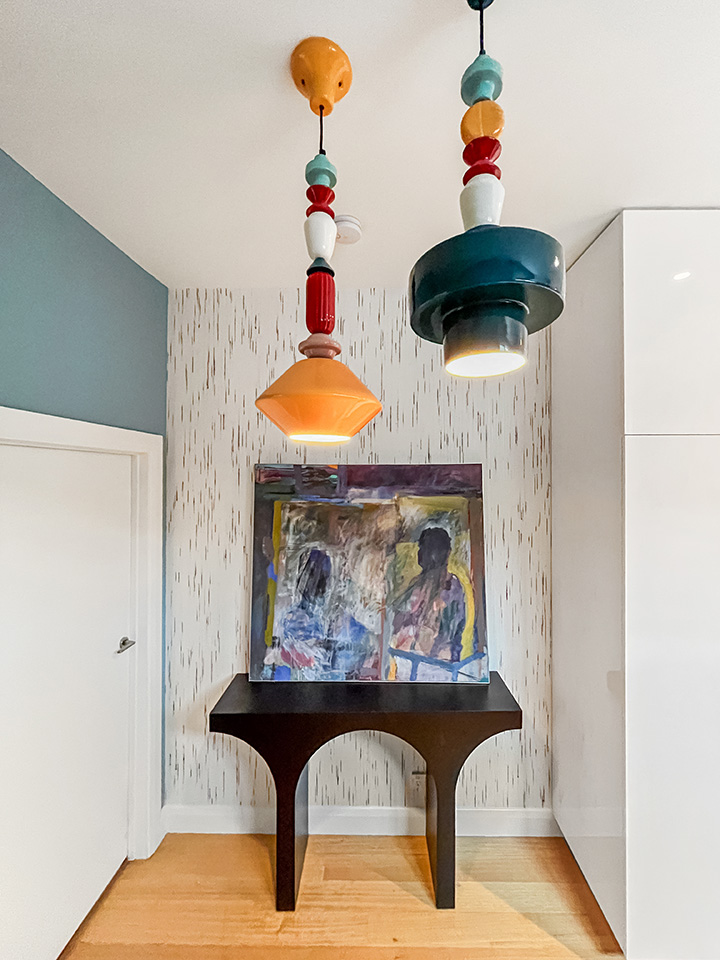
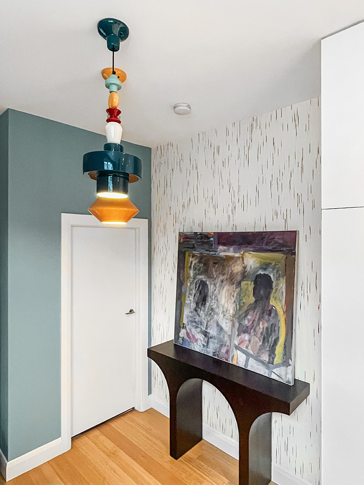
The house was filled with downlights, so many downlights! So, we introduced some feature pendants to create some visual interest. Over the stairs, we added a cluster of pendants in varying shapes and colours to draw the eye up. White, black, blue, yellow and green, the pendants reflect the colours in the runner.
Alcove
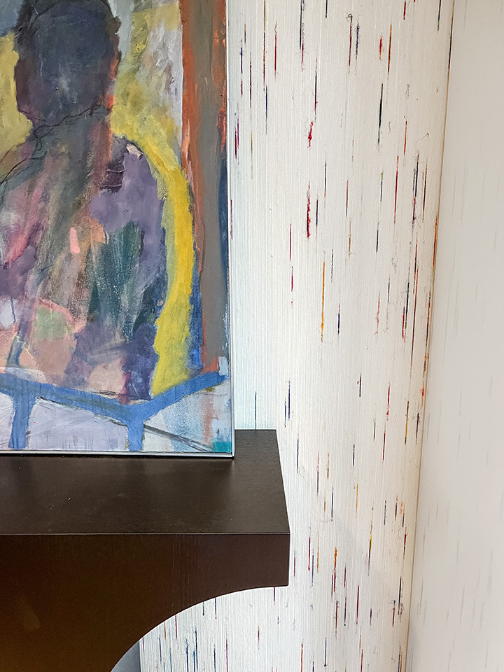
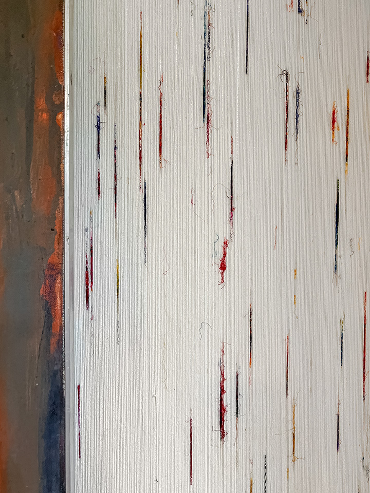
In the entry hallway, there was an alcove to the side, which was perfect for a feature wallpaper, a hall table, and pendants. Using the stair runner as a colour reference, I found a wallpaper that didn’t scream ‘wallpaper’ or ‘pattern’. My clients were adamant they didn’t want something highly patterned in the entry. The wallpaper’s textured white base features slubbed details running through blues, pinks, yellows, purples, and greens. These small slubs are made of recycled silk saris, so you can imagine the vibrancy of the colours present.
Powder room
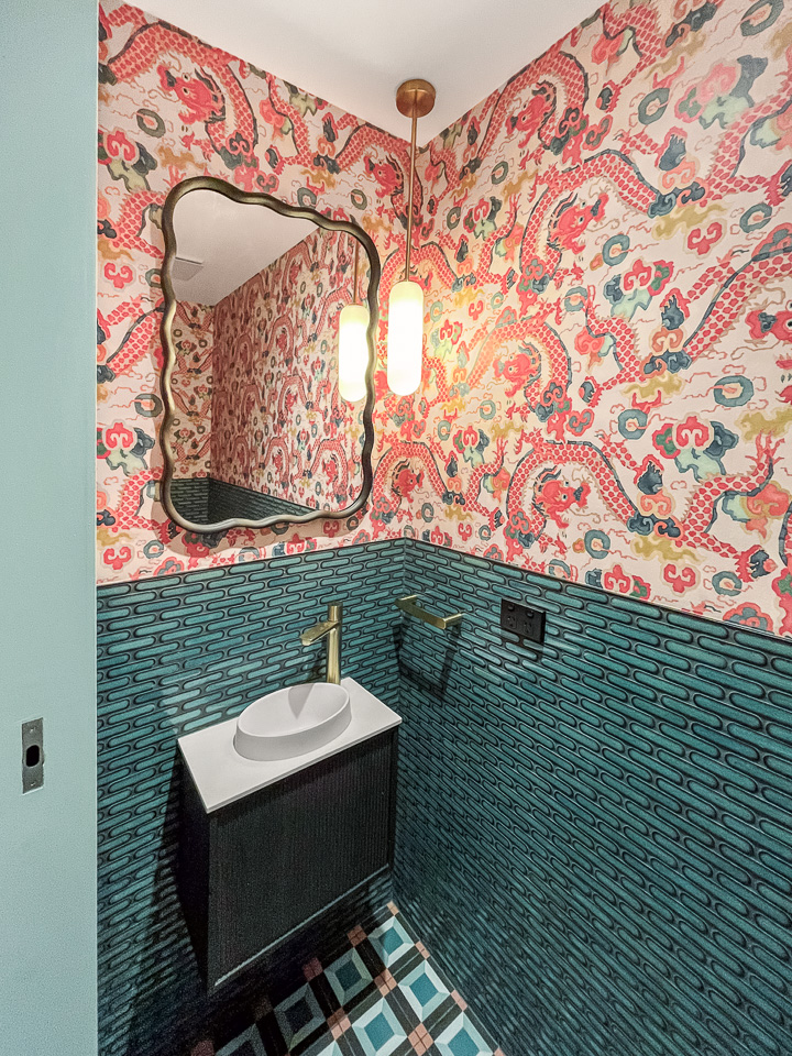
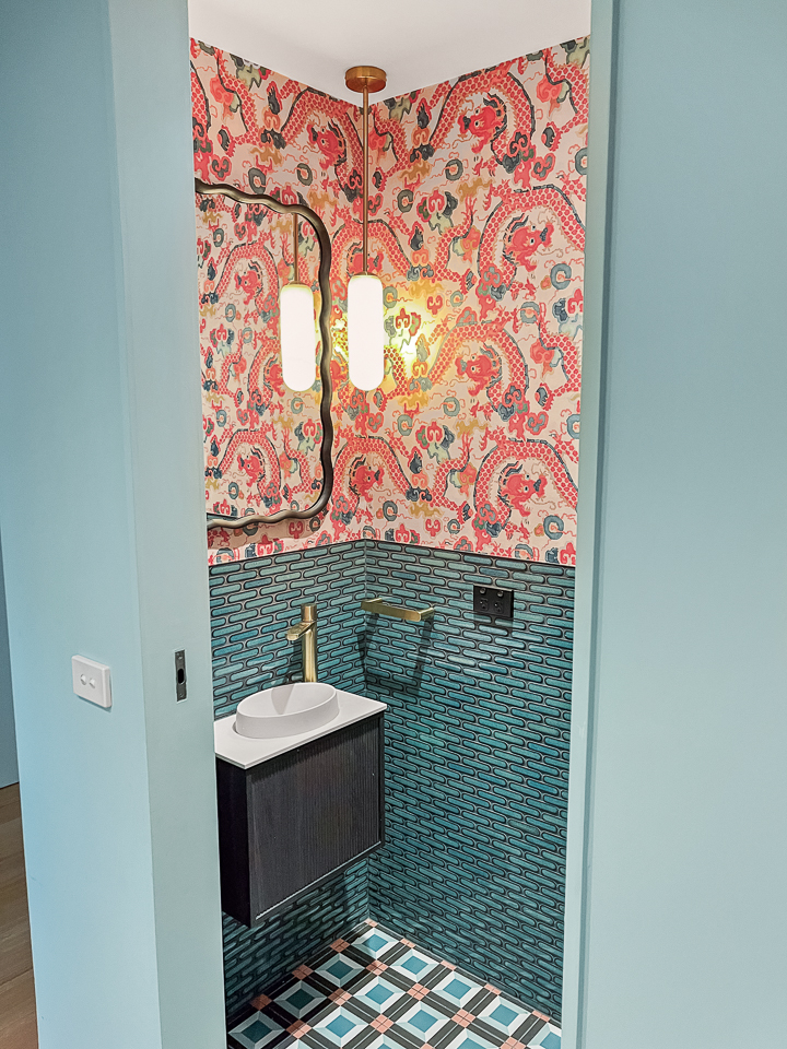
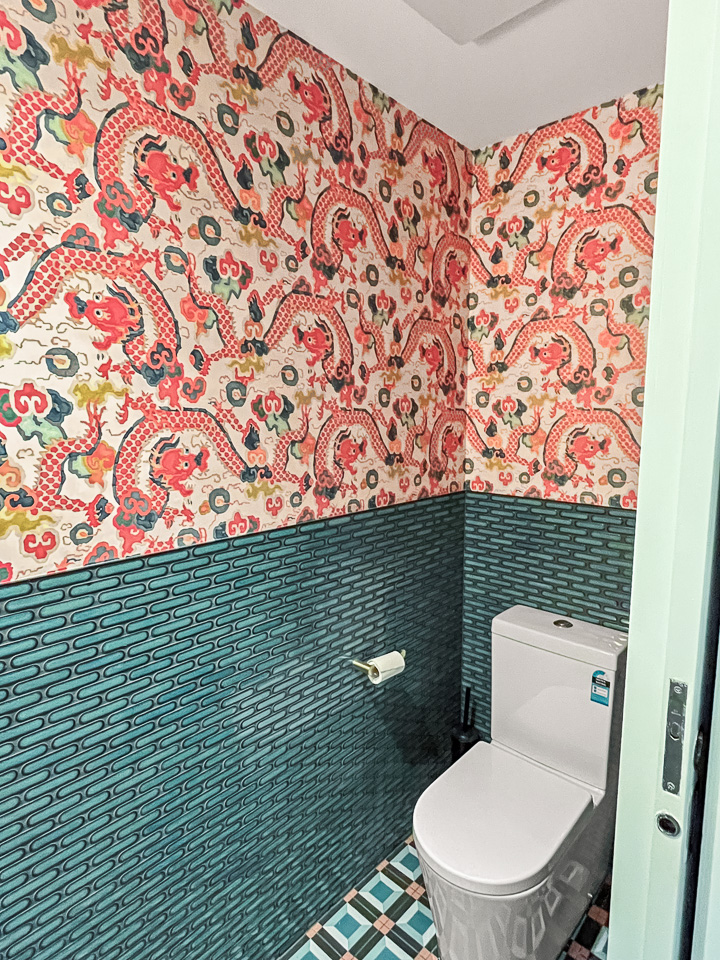
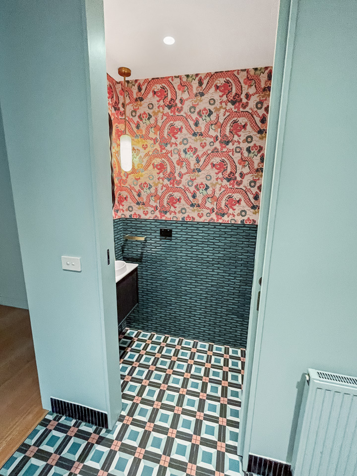
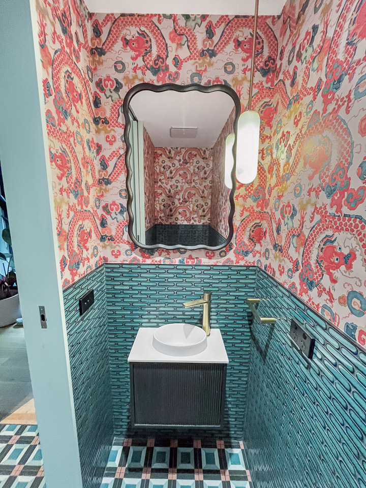
Moving down the hallway, you enter a windowless section of the house containing a powder room and laundry. Again, these areas had white walls and bland beige floor tiles. My clients loved blues and teals, as well as red/orange/russet tones. I found a wallpaper design with all these colours and dragons. Yes, dragons. Because, why not!? Powder rooms are crying out for some colour and fun. Glossy Kit Kat tiles wrapped the room, while on the floor, we used a geometric tile design in similar tones. Finishing with a simple black vanity, a fun wavy black mirror and a mini feature pendant in white and gold.
In the laundry, we used the same tiles but added a textured plain wallpaper in green/blue tones to each side of the room. On the remaining walls, we painted the space in a blue/green tone, picking up the floor tile tones.
In conclusion
In the end, this Brunswick home transformed from a sea of white into a lively and welcoming environment, reflecting my clients’ personalities beautifully. I handpicked each colour choice and design element to create a harmonious balance between fun and sophistication. The entrance now greets visitors with warmth, while the playful touches in the powder room and laundry bring a smile to everyone’s face. Ultimately, this project was not just about aesthetics; it was about crafting a home that tells a story, celebrating the joy of living in a space that feels uniquely theirs.


