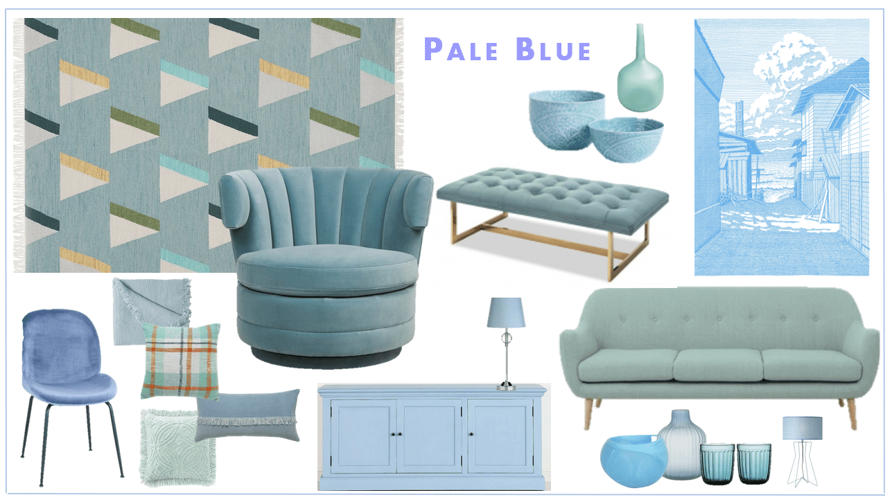
Colour of the moment…Pale Blue
Pale blue, baby blue, cornflower, powder blue….they’re all roughly the same. Pale blue is a colour of the moment that I really enjoy working with, especially in living rooms. This shade of blue often feels like an extension of a neutral tone. On the scale of being daring with colour, pale blue is a good, safe choice. It’s a great colour to introduce if you’re wary of being too colourful.
1- Colour of the moment…Pale Blue
This living room is a peaceful, relaxing space. Even with the pop of colour in the artwork, its calming.
This is great example of how a space with blue walls doesn’t feel overly “colourful”. It’s a safe tone.

2 – Colour of the moment…Pale Blue
Pale blue translates really well to traditional style homes. With lots of white, the blue looks lovely like a Wedgwood plate. Pale blue looks lovely with gold accents.

3- Colour of the moment…Pale Blue
This living room is a great example of where the introduction of pale blue has given this space a whole new feel. With some accents in deeper, navy tones, the overall look however is still quite neutral.

4- Colour of the moment…Pale Blue
The choice of going with blue for this modular sofa has created an elegant, refined space. The coolness of the blue suits the glass and chrome details. If you’re concerned with the space being too cool, adding other tones of blue with mix it up.